<h1>
Ipsos isay x Purdue
</h1>
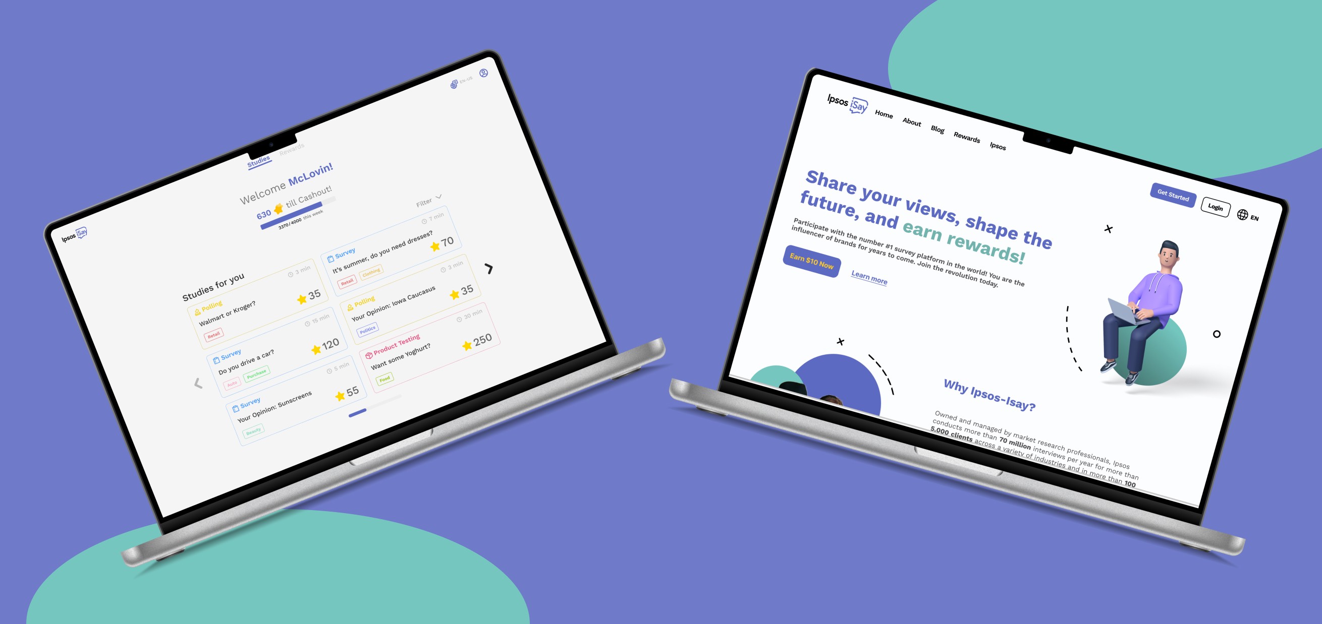
Company
Ipsos isay x Purdue
Role
UX Researcher, Web Designer
Team
7 UX Designers
Time-Line
January 2024 - April 2024
<h2> Description </h2>
Ipsos iSay is an online survey rewards community operated by Ipsos, a global market research firm. with millions of member across more than 50+ markets globally. Ipsos is consider one of the world largest market research firm.
<h2> My Scope </h2>
In this project, my primary focus was on research, where I honed my skills as a UX designer by delving deeply into human behavior to better understand user interactions within the surveys field. I took the lead in exploring user patterns and gathering insights that would shape the design process. Additionally, I was responsible for the web design aspect for Ipsos iSay, translating research findings into an intuitive and user-friendly interface.
<h2> The Problems </h2>

Restricted functionality and efficiency, caused by poor UI

Lack Of User Retention

Poor User Experience of the surveys
<h2> Secondary Research </h2>
After our initial meeting with the sponsor, where we delved into the project's goals, expectations, and potential challenges, we were equipped with a clear vision to guide our next steps. We embarked on a journey of discovery, beginning with a deep dive into secondary research on Ipsos i-Say. This phase was crucial for us to grasp the company's standing in the market and to gain insights into its diverse user base.
To further enrich our understanding, we conducted a quick yet thorough evaluation of their existing website, identifying key areas of strength and opportunities for improvement. We didn't stop there; we ventured into academic territory, exploring research papers that shed light on the nuances of surveys, the intricacies of user psychology in digital spaces, and the vital aspects of user attention and retention spans. This comprehensive research laid a solid foundation for our project, setting the stage for what was to come
The result:
Average attention span of user: 8-12 seconds for motion content.
Average Web page visit duration: 1-2 minutes for top to bottom scroll.
Shorter Surveys are more reliable and are completed more often
Survey Lengths identified:
Short: 3-5 minutes
Medium: 5-7 minutes
Long: 10-20 minutes
<h2> Competitive Analysis </h2>
We decided to divide into two teams to tackle the project from different angles. The first team focused on real-time testing and conducting user interviews. Their mission was to gain a deeper understanding of the current product and observe user behavior firsthand. By engaging directly with users, they aimed to uncover insights that could highlight strengths and reveal potential pain points in the user experience.
Team 1
Time-Time Testing and User interview

Team 2
Competitive Analysis

Meanwhile, my team conducted a competitive analysis of 14 platforms. I led this effort to explore and evaluate competitors, identify industry trends, and pinpoint the key elements that make a survey platform successful. This research aimed to gather insights that would help us create a standout product in the market.
We signed up for multiple survey websites created tables for highlighting key points to see what would and what would not work for Ipsos Isay
<h2> Findings </h2>
After conducting a competitive analysis, we uncovered some unique features our competitors offer in their surveys. These insights opened our eyes to different approaches and possibilities that we hadn't previously considered.

Leader board to push user to compete
Progress Bar for the surveys

Guide and tips features for new user

Suggestion Surveys Section for user
We reconvened to assess which of these features would be the best fit for Ipsos iSay, carefully considering how they align with our platform's goals and user needs.

Leader board
Pro:
Encourage users to take surveys more often.
Create a competitive environment for users to compete.
Could lead to an increase in the retention rate.
Cons:
Leads to inaccurate responses in the surveys, as users only focus on speed and earning points and rewards.
Distracts users from the actual purpose of taking a survey and providing meaningful answers for Ipsos.

Progress Bar for the surveys
Pro:
Help users keep track of the survey length.
A progress bar can encourage users to continue with the surveys until the end.
Cons:
Progress bar is intimidating, makes user quit earlier if it a longer surveys.
Distracts users from the main surveys, making them focus on completing surveys quickly just to earn points.

Guide and tips features for new user
Pro:
Help users become more familiar with Ipsos iSay.
Walk users through step-by-step to provide a smoother experience.
Cons:
No major concerns

Suggestion Surveys Section for user
Pro:
Reduce decision-making time for users to choose a survey
Help users participate in their favorite types of surveys and encourage them to take more.
Cons:
Could prevent user to explore and try different type of surveys.
Result:
After careful consideration, we chose to remove the leaderboard feature. We noticed it was drawing users' attention away from the main purpose, potentially affecting the quality of Ipsos iSay's research studies. By eliminating this distraction, we aimed to keep the focus on gathering meaningful insights, ensuring the platform aligns with the company's core objectives.
<h2> Heuristic Evaluation </h2>
In this activity, we performed a detailed heuristic evaluation of the current product. My primary responsibility was to analyze and assess the main landing page, while the other designer focused on the surveys page. Through this evaluation, I identified several key issues that were affecting the user experience.
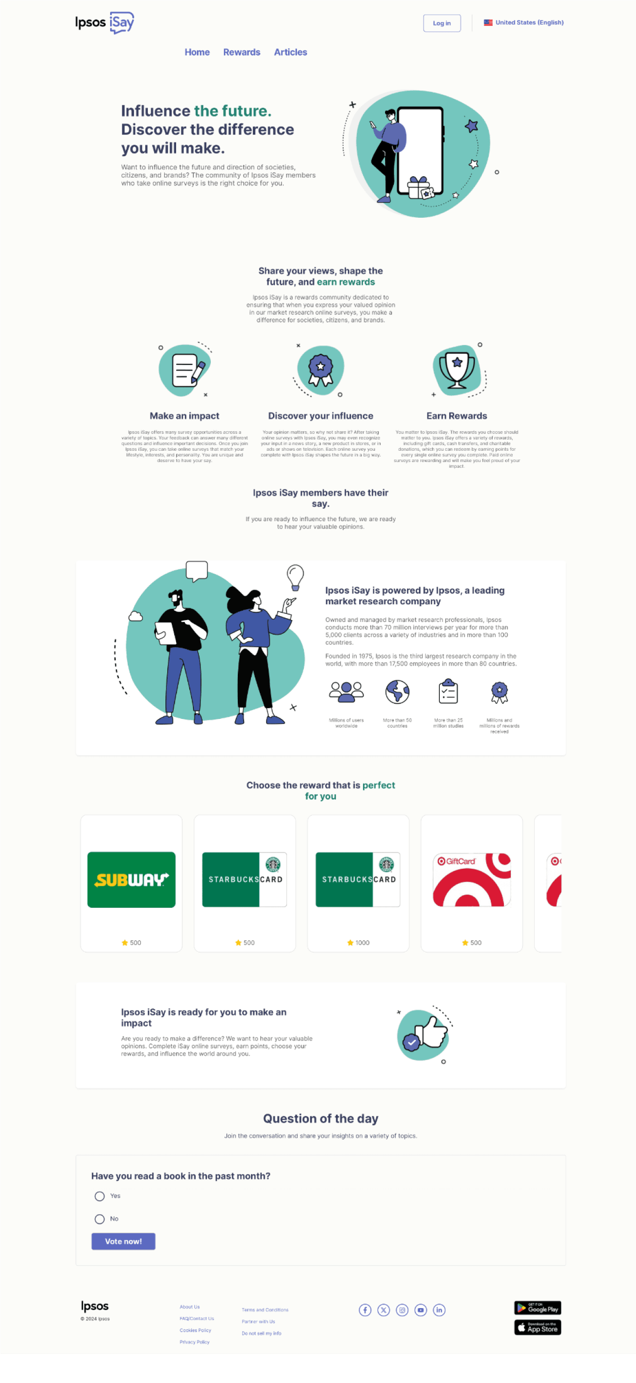
Poorly aligned menu section.
Unclear Header
Long text without SEO optimization makes it harder for users to scan.
No call to action
Graphics are generic and don't convey much information.
Too much unnecessary information.
Long text makes it harder for users to scan.
No highlight key words for better scanning
Graphics are generic and don't convey a lot of information
No button to take users to reward page to help user explore more about the rewards
No call to actions button at the end
After completing our individual evaluations, we came together as a group to share our results and discuss the insights we gained. This exchange was invaluable, as it allowed us to collectively understand the current product's problems and identify areas that needed improvement.
<h2> Ideation </h2>
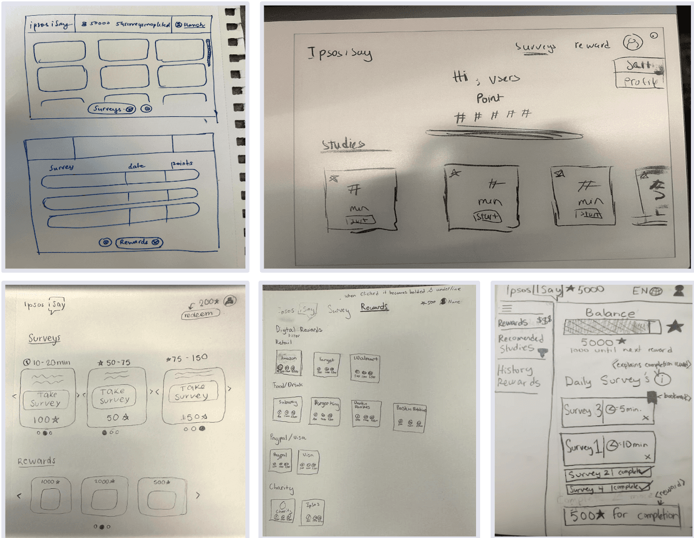
Sketching:
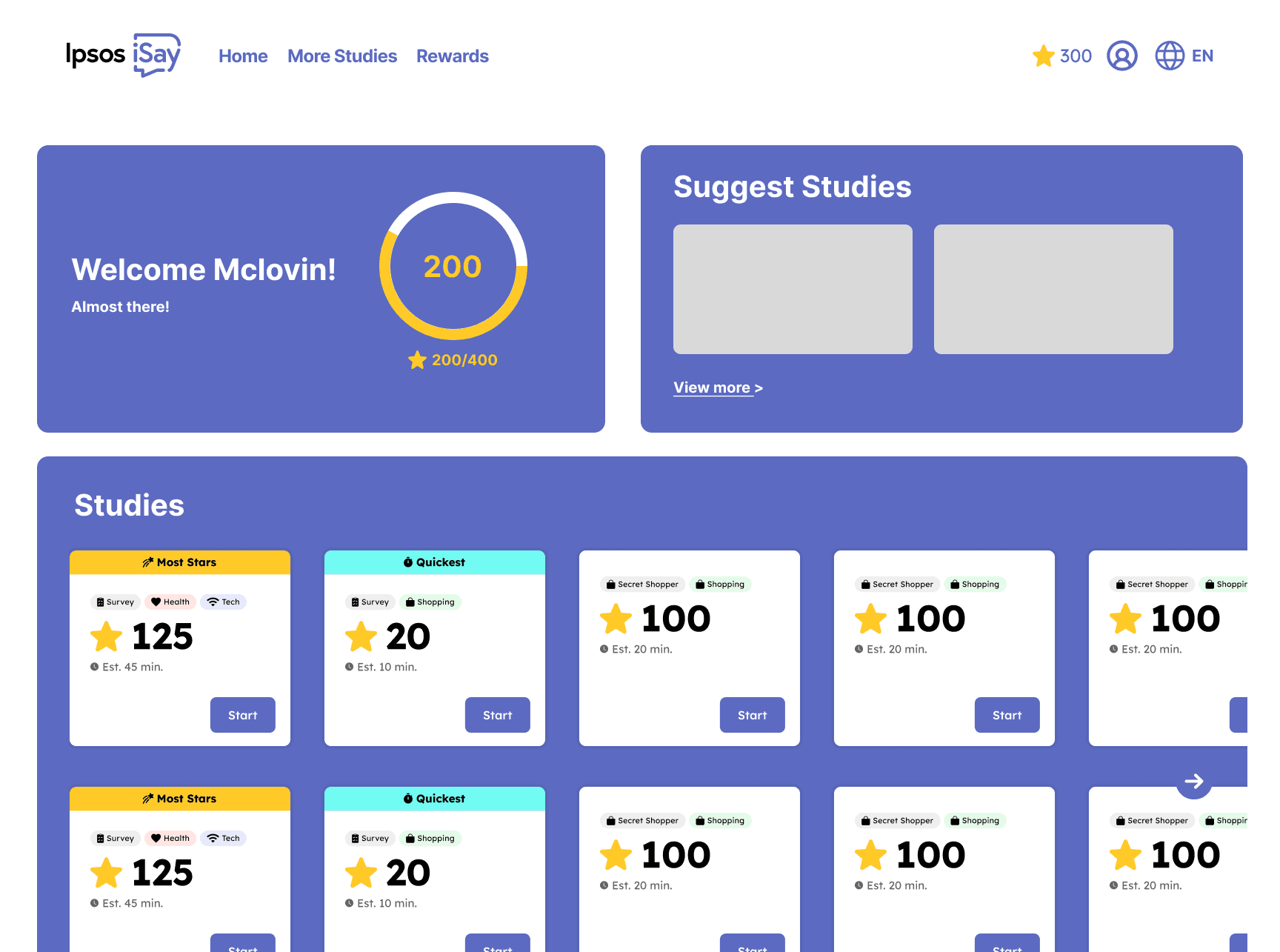
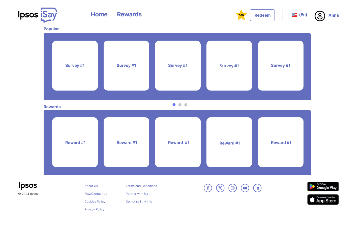
In our sketching process for the surveys UI, I focused on integrating a progress bar to boost user engagement. This feature was crafted to clearly show the remaining points users needed to earn rewards, adding a motivating and intuitive aspect to the experience. We refined this element through several iterations and team feedback, ensuring it fit seamlessly into the overall platform design. Additionally, from my heuristic evaluation of the website, I created a quick sketch centered on the information structure, providing a clear overview of the layout and organization.
Mid -Fidelity:
After finalizing the layout and functionality of the features, we moved on to mid-fidelity designs. At this stage, our primary focus was on the user flow, making sure that transitions between pages were smooth and intuitive. We revisited our earlier research to gain deeper insights into the specific features, which helped us create a more refined and coherent design. This process set a strong foundation for developing the final high-fidelity prototypes.
<h2> Final Product </h2>
Crafting the final high-fidelity product, I took charge of redesigning the website's landing page. I started by identifying key issues and integrating research insights with valuable feedback from my teammates. With this foundation, I developed a new information architecture that addressed user needs. After several rounds of iteration, I refined the UI elements to ensure Ipsos was presented in the most user-friendly manner. The end result was a platform that was not only visually appealing but also intuitive, making it effortless for users to scan and understand.
Website Landing Page
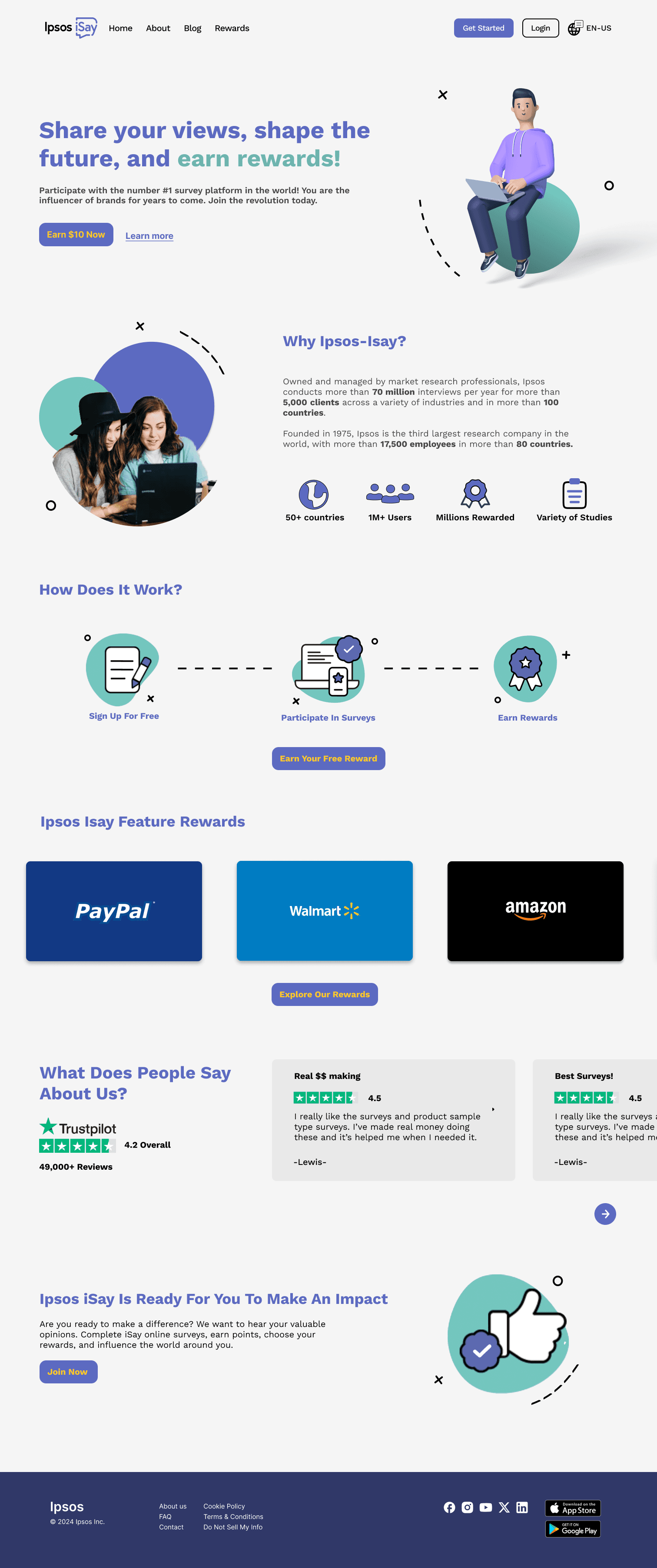
Proper align menu section.
A clear header to inform users about the general functions of Ipsos iSay.
A subheader optimized for SEO.
Attractive call to action button.
Tell the user why they should use Ipsos iSay
Highlight keywords to help users scan more easily.
Friendly modern graphics
A quick guide to show users how Ipsos iSay works.
An extra attractive call to action to encourage users to get started
To give users a better idea of the types of rewards they will receive.
Attract user with popular rewards
Build user trust and confirm the trustworthiness of the platform.
Users can save time by quickly scanning the feedback from other users.
FInal call to action
Team final Surveys page final Product
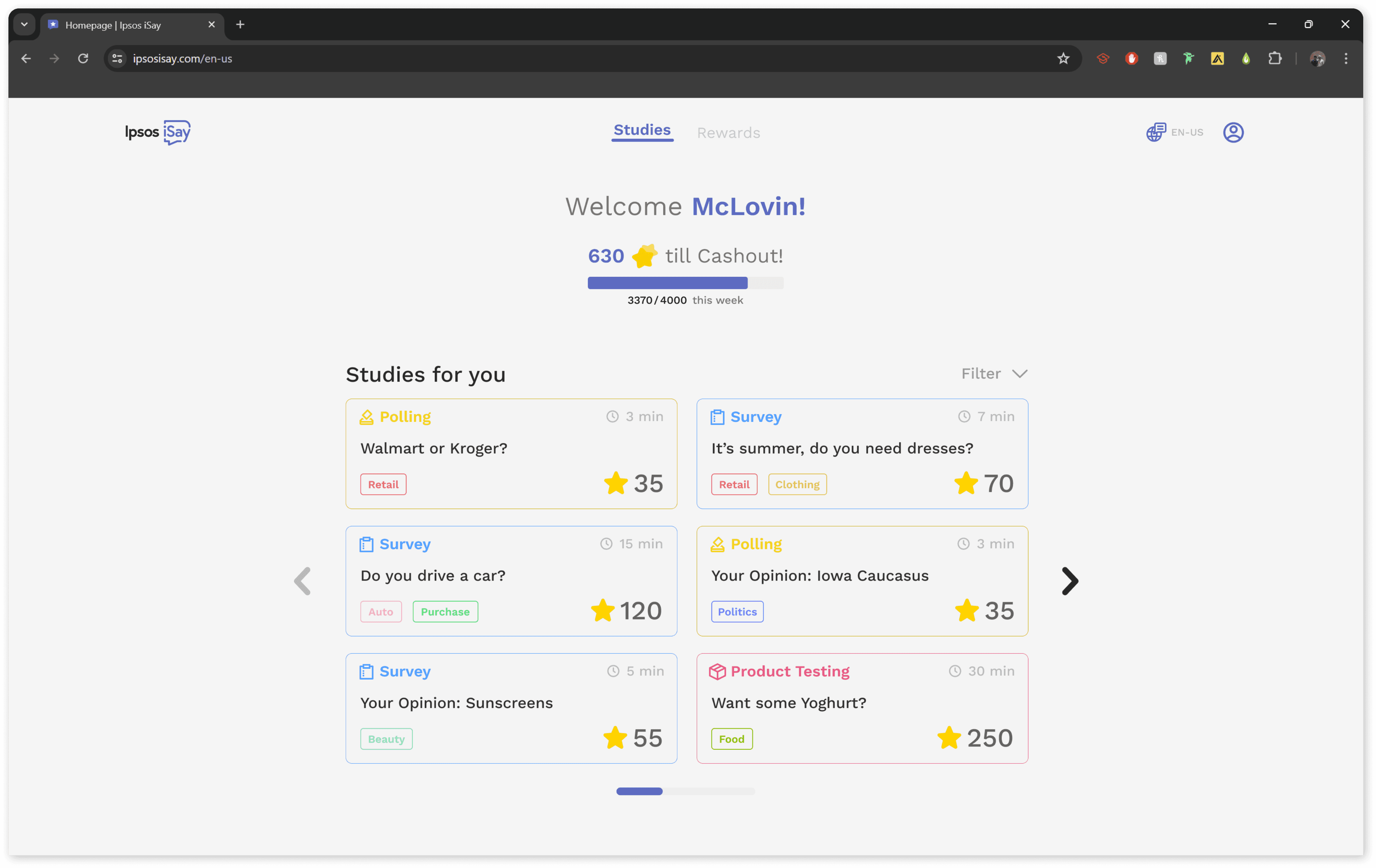
Simplified navigation
Progress bar adds game-like element
Color codes and tags make this section more descriptive and scannable
Limited to 6 surveys to reduce decision fatigue
<h2> Reflection </h2>
This project was an excellent opportunity to hone my research skills as a UX designer. I gained valuable experience in resolving conflicts with other designers and collaborating effectively to find solutions. Additionally, I was able to utilize my web design skills and deepen my understanding of human psychology and behavior when interacting with a surveys platform. Working with clients who had limited UX knowledge also taught me how to communicate design concepts clearly and align our work with their expectations.